Building a design system 2 - setup continued


- 11 min read
In the first part of the series, we set up a repository, configured our tooling, and started coding. In this exercise, there are a few more details to cover before we get to creating theme features in the theming engine.
The code for this post is available at:
Goals
- Begin adding helpers
- Add types for styles
- Add a stylesheet provider
- Write tests for new additions
- Add Rollup and configure bundling
Difficulty level
Advanced. This is an advanced tutorial and assumes that you are a moderately experienced frontend developer. Beginning developers may find this challenging.
Overview
In the first part of this series, we set up a repository and started adding code. We installed the first few dependencies, created some Typescript types, configured a test framework and a Redux store, then added a stylesheet creator. All of the initial housekeeping and tooling are done, although it's not yet useful.
Our goal in this exercise is to add a stylesheet provider, a function that will attach a stylesheet to a host application's markup and package it so we can try it out. Before beginning, let's examine a little more about how the system works.
We're working towards the goal of accepting a JSS object, transpiling it to CSS, and attaching it to some HTML.
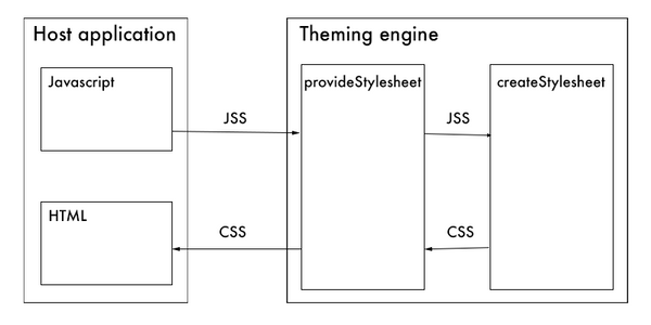
The diagram shows how JSS comes from the host application, and CSS is returned to it. This is our immediate goal, and after we accomplish that, we can think about the themes that will provide values to the JSS, and then have the JSS come from components in our component library. With each exercise, we'll add more to our block diagram until we have all the features.
We already have the stylesheet creator from exercise 1, so let's proceed to add the stylesheet provider and package what we've built.
Dependencies
It should surprise nobody that we have more dependencies awaiting us. Let's start there.
Rollup
Rollup is our packaging tool. We need it and then some adjacent packages.
Install using NPM or Yarn:
npm install --save-dev rollup rollup-plugin-generate-package-json rollup-plugin-terser
or
yarn add --dev rollup rollup-plugin-generate-package-json rollup-plugin-terser
Now add a few more plugins.
Install using NPM or Yarn:
npm install --save-dev @rollup/plugin-commonjs @rollup/plugin-node-resolve @rollup/plugin-typescript
or
yarn add --dev @rollup/plugin-commonjs @rollup/plugin-node-resolve @rollup/plugin-typescript
rimraf
The rimraf package is a tool that provides the equivalent of rm -rf for Node. We use this in our NPM build script to clean up where needed.
Install using NPM or Yarn:
npm install --save-dev rimraf
or
yarn add --dev rimraf
tslib
Rollup relies on tslib to compile Typescript.
Install using NPM or Yarn:
npm install --save-dev tslib
or
yarn add --dev tslib
Configure Rollup
Add rollup.config.js to the project root, and configure it for ES modules and CommonJS modules.
// file: /rollup.config.js

import commonjs from '@rollup/plugin-commonjs';
import generatePackageJson from 'rollup-plugin-generate-package-json';
import { nodeResolve } from '@rollup/plugin-node-resolve';
import { terser } from 'rollup-plugin-terser';
import typescript from '@rollup/plugin-typescript';

const baseContents = pkg => ({
  author: pkg.author,
  bugs: pkg.bugs,
  dependencies: {},
  description: pkg.description,
  homepage: pkg.homepage,
  license: pkg.license,
  main: './node/whirlwind.js',
  name: pkg.name,
  repository: pkg.repository,
  sideEffects: false,
  version: pkg.version
});

const external = ['jss', 'jss-preset-default', 'redux'];

const input = 'src/public-api.ts';

export default [
  {
    external,
    input,
    output: {
      dir: 'dist',
      format: 'es'
    },
    plugins: [typescript(), nodeResolve(), commonjs(), generatePackageJson({ baseContents })]
  },
  {
    external,
    input,
    output: {
      file: 'dist/node/whirlwind.js',
      format: 'cjs',
      name: 'whirlwind',
      plugins: [
        terser({
          compress: {
            drop_console: true
          },
          output: { quote_style: 1 }
        })
      ]
    },
    plugins: [typescript(), nodeResolve(), commonjs()]
  }
];
This is a configuration only for this exercise. When it comes to Rollup, feel free to adjust to your needs, and include the modules that you need.
If we plan on distributing an NPM package, we need a package.json file in the distributed package. The baseContents function tells the generatePackageJson plugin what should be in the package.json file that gets distributed in our package. It's a function by convention and named according to the plugin. The plugin requires an argument that looks like this:
{ baseContents: (pkg) => { ... } }
The function allows the plugin to use values from our project package.json. In addition, there is a main property, which is the entry point for CommonJS modules.
The default export has two configuration objects, one for ES modules and the other for CommonJS modules.
Add types
The last time we created types, we created them for the store and stylesheet. This time we need types for styles. Add this to your types.ts file:
// snippet from file: /src/types/types.ts

import * as CSS from 'csstype';

type JSSNormalCssProperties = CSS.Properties<number | string>;
type JSSFontface = CSS.AtRule.FontFace & { fallbacks?: CSS.AtRule.FontFace[] };

export interface BaseCSSProperties extends JSSNormalCssProperties {
  '@font-face'?: JSSFontface | JSSFontface[];
}

export interface CSSProperties extends BaseCSSProperties {
  [key: string]: unknown | CSSProperties;
}

export type Styles = StylesJSS | CSSProperties;
First are types for CSS properties and @font-face, then a base interface, then the important one, the CSSProperties interface.
Since we're working with both JSS and CSS, the Styles type is a union of both.
With a bit of refactoring, the types file now looks like this:
// file: /src/types/types.ts

import * as CSS from 'csstype';
import { Styles as StylesJSS, StyleSheet as StyleSheetJSS } from 'jss';

type JSSNormalCssProperties = CSS.Properties<number | string>;
type JSSFontface = CSS.AtRule.FontFace & { fallbacks?: CSS.AtRule.FontFace[] };

export interface BaseCSSProperties extends JSSNormalCssProperties {
  '@font-face'?: JSSFontface | JSSFontface[];
}

export interface CSSProperties extends BaseCSSProperties {
  [key: string]: unknown | CSSProperties;
}

export type Styles = StylesJSS | CSSProperties;

export type StyleSheet = StyleSheetJSS;

export interface Theme {}

export const ADD_SHEET = 'ADD_SHEET';

export type Sheet<K extends keyof any, StyleSheet> = { [P in K]: StyleSheet };

interface AddSheetAction {
  type: typeof ADD_SHEET;
  sheet: Sheet<string, StyleSheet>;
}

export type ActionTypes = AddSheetAction;

export interface State {
  sheets: Sheet<string, StyleSheet>;
  theme: Theme;
}
Helpers
Over the course of this project, we'll be collecting helper functions. There are string helpers, color helpers, utilities, and nice-to-have things that help us stay DRY.
The first of these is a string helper that converts camelCase to kebab-case. Since we dynamically create class names, this helper makes sure we use consistent cases in the output by making camelCase words lowercase and inserting a dash.
// file: /src/helpers/fromCamelToDash/fromCamelToDash.ts

export default function fromCamelToDash(value: string): string {
  function converter(g) {
    return '-' + g[0].toLowerCase();
  }
  return value.replace(/([A-Z])/g, converter);
}
Stylesheet provider
The stylesheet provider takes a JSS object as input, passes it to the stylesheet creator, which returns a JSS stylesheet object, then the provider attaches the CSS stylesheet to the markup of the calling application.
Add this file to the styles folder:
// file: /src/styles/provideStylesheet/provideStylesheet.ts

import { Styles, StyleSheet, StyleSheetFactoryOptions } from 'jss';
import createStylesheet from '../createStylesheet/index';
import { addSheet, store } from '../../store/index';
import fromCamelToDash from '../../helpers/fromCamelToDash/index';

const styleSheetFactoryOptions: StyleSheetFactoryOptions = {
  index: 5,
  meta: 'Styles'
};

export default function provideStylesheet(styles: Styles, options: StyleSheetFactoryOptions = {}): StyleSheet {
  options.generateId = options.meta ? (rule, sheet) => `${options.meta}-${fromCamelToDash(rule.key)}` : undefined;
  options = { ...styleSheetFactoryOptions, ...options };
  const key = options.meta === styleSheetFactoryOptions.meta ? JSON.stringify(styles) : options.meta;
  const sheet = key ? store.getState().sheets[key] : key;
  const stylesheet: StyleSheet = sheet ? sheet : createStylesheet(styles, options).attach();
  if (key) {
    store.dispatch(addSheet({ [key]: stylesheet }));
  }
  return stylesheet;
}
So what's going on here? Settle in. We're going deep on theory.
If you look at the imports, you'll notice we import the Styles and StyleSheet types from JSS. Remember we extended these in our types? We can't use them here because we are passing arguments to a JSS function, not one of ours, so we use the types the called function uses.
Next, we set up the default stylesheet factory options. The index is the order in which stylesheets are attached to the markup. Stylesheets are attached in ascending order, index 1, then 2, then 3, etc. Our index scheme looks like this:
- 1 - Baseline or reset CSS
- 2 - Component library components that do not use other component library components.
- 3 - Component library components that are made with other component library components.
- 4 - Not used.
- 5 - Default.
All of our internal components will override the defaults. Custom stylesheets requested by a host application might not, so we default to the value that puts stylesheets at the end of the cascade. Leaving 4 unused gives the host application developer some flexibility should they choose to order the custom stylesheets in the cascade.
The function itself takes two arguments, a JSS styles object and, optionally, stylesheet factory options.
The first thing the function does is create a custom class name prefix, but only if stylesheet factory options have provided a meta property.
options.generateId = options.meta ? (rule, sheet) => `${options.meta}-${fromCamelToDash(rule.key)}` : undefined;
One of the stylesheet factory options not exposed in our types is generateId. If we provide a function as the value of generateId, it will use that function to generate a class name instead of the internal function.
The internal function uses a counter. By default, numbers are appended to rule names incrementally by stylesheet. This is how encapsulation works.
Consider a JSS object that looks like this:
{
  root: {
    display: 'inline-block',
    paddingTop: 12
  },
  dark: {
    backgroundColor: '#333',
    color: '#fff',
    '& .hover:hover': {
      backgroundColor: '#4f4f4f'
    },
    '& .selected': {
      backgroundColor: '#4f4f4f'
    }
  },
  fullWidth: {
    display: 'block',
    width: '100%'
  },
  light: {
    backgroundColor: 'transparent',
    color: '#333'
  }
}
It will transpile, using the internal ID generator, to CSS that looks like this:
.root-0-1-11 {
  display: inline-block;
  padding-top: 12px;
}
.dark-0-1-12 {
  color: #fff;
  background-color: #333;
}
.dark-0-1-12 .hover:hover {
  background-color: #4f4f4f;
}
.dark-0-1-12 .selected {
  background-color: #4f4f4f;
}
.fullWidth-0-1-13 {
  width: 100%;
  display: block;
}
.light-0-1-14 {
  color: #333;
  background-color: transparent;
}
We use the default generator with the default meta.
What happens if we have meta in the stylesheet factory options argument? The ternary in the above assignment checks for it, and if it is there, assigns a generateId function.
(rule, sheet) => `${options.meta}-${fromCamelToDash(rule.key)}
This replaces the internal generator, which, when called, gets two arguments. We don't have to use them in our function, but the properties must be there.
See how the fromCamelToDash helper is used to force kebab case? The transpiler will replace spaces with dashes, but we want it all dashes, and since JSS key values are almost surely camelCase, we convert it to kebab.
Suppose we do provide a meta value in the stylesheet factory options argument.
{
  meta: 'eh-menu'
}
Our generator function is used, and the resulting CSS looks like this:
.eh-menu-root {
  display: inline-block;
  padding-top: 12px;
}
.eh-menu-dark {
  color: #fff;
  background-color: #333;
}
.eh-menu-dark .hover:hover {
  background-color: #4f4f4f;
}
.eh-menu-dark .selected {
  background-color: #4f4f4f;
}
.eh-menu-full-width {
  width: 100%;
  display: block;
}
.eh-menu-light {
  color: #333;
  background-color: transparent;
}
All of our components will have CSS that looks like that because we provide a meta value in the stylesheet factory options.
This is favorable because all components should use the same class names for styling. This makes them extendable and overrideable via CSS or SCSS in addition to JSS. It also makes sure only one stylesheet is needed for all of the same components in a view. In other words, you might have ten buttons on a page but only one button stylesheet for all of them.
On the other hand, this is unfavorable for custom stylesheets because we want them encapsulated. Unless they, too, provide a meta value.
Moving along with our stylesheet provider, we next spread the stylesheet factory argument over the default stylesheet factory options.
options = { ...styleSheetFactoryOptions, ...options };
Why do this? There should always be a meta value for troubleshooting. It will label the stylesheet in the markup. The default meta will look like this (for brevity, the CSS is omitted):
<style data-jss="" data-meta="Styles">
  ...
</style>
The custom meta we used earlier will look like this:
<style data-jss="" data-meta="eh-menu">
  ...
</style>
Taking a break
Let's take a break for a moment. Before we see how the stylesheet provider uses the store to make sure only one stylesheet of a kind is attached to the HTML, let's think about those classes we created.
How do we work with them? In an upcoming exercise, we'll use them in a component, but how? Do we need to know the class names, and how do we know if they have unpredictable numbers appended to their names?
The answer is that we don't work with them directly. We make sure internal components have consistent and predictable names as a courtesy to the developer, who may need to target them via CSS, but with JSS, they aren't used directly.
Instead, the JSS stylesheet object has two things in it. The stylesheet that gets attached to the host markup and a classes object. The classes object uses our JSS keys as keys and the generated class names as values.
If we want to use them, which we will when we build the classes provider in a future exercise, we destructure them from the JSS stylesheet object and have something like this, shown using our eh-menu meta from before.
{
  root: 'eh-menu-root',
  dark: 'eh-menu-dark',
  fullWidth: 'eh-menu-full-width',
  light: 'eh-menu-light'
}
Hopefully, that provides some context for why we're manipulating the class names and some understanding of where we're heading with our development. For now we're not concerned with classes, just the sheet, so let's get back to work.
Back to work
Let's sort out a key for state.
const key = options.meta === styleSheetFactoryOptions.meta ? JSON.stringify(styles) : options.meta;
The last thing we did before taking a break was spread the options argument over the default stylesheet factory options. If no meta was provided in the argument, the meta will be the default. Since the default never changes, it is not a unique key in the way that eh-menu would be. That means the styles with the default key might not be the same as another styles with the default key. In the case of a custom key, it is. So, to get a unique key, stringify the styles.
If we do have a custom meta, use it.
Now select the sheet from the store. If it's in the store, we'll get a stylesheet object, if not, it will be undefined.
const sheet = key ? store.getState().sheets[key] : key;
If we just select from the store, Typescript knows it could possibly be undefined and will throw an error. The ternary makes TS happy.
The constant, sheet, will be either a stylesheet object, or undefined.
const stylesheet: StyleSheet = sheet ? sheet : createStylesheet(styles, options).attach();
If it's a stylesheet object, there is no need to call the stylesheet creator. If it is undefined, then we call the creator, and attach it to the markup. The stylesheet object has an attach method, which you see called after the creator returns a stylesheet object.
Remember, if there is a sheet in the store, then that sheet is attached to the markup. We only call attach on a new stylesheet object.
Then we dispatch it to the store in a type safe way.
if (key) {
  store.dispatch(addSheet({ [key]: stylesheet }));
}
After which, we return the stylesheet object.
Don't forget to add it to the barrel.
// file: /src/styles/provideStylesheet/index.ts

export { default } from './provideStylesheet';
export * from './provideStylesheet';
Followed by adding the exports to the parent folder index.
// snippet from file: /src/styles/index.ts

export { default as provideStylesheet } from './provideStylesheet/index';
export * from './provideStylesheet/index';
Styles creator
One last detail before writing tests. We need a function to return our JSS object. The styles creator does nothing but return what we provide it. Since we can't and won't make assumptions about the TS config in a host application, returning the JSS object from a function will prevent Typescript type widening.
// file: /src/styles/createStyles/createStyles.ts

import { Styles } from 'jss';

export default function createStyles(styles: Styles): Styles {
  return styles;
}
Export it from an index.
// file: /src/styles/createStyles/index.ts

export { default } from './createStyles';
export * from './createStyles';
Add it to the parent folder index.
// snippet from file: /src/styles/index.ts

export { default as createStyles } from './createStyles/index';
export * from './createStyles/index';
Tests
Now we can write some tests. First, a test for the helper we added.
// file: /src/helpers/fromCamelToDash.test.ts

import fromCamelToDash from './fromCamelToDash';

describe('fromCamelToDash', () => {
  it('should covert camel case to dash case', () => {
    const initialString = 'callMeIshmael';
    const expectedString = 'call-me-ishmael';
    const returnedString = fromCamelToDash(initialString);
    expect(returnedString).toBe(expectedString);
  });
});
Now a test for the styles creator.
// file: /src/styles/createStyles/createStyles.test.ts

import { Styles } from '../../types/index';
import createStyles from './createStyles';

describe('createStyles', () => {
  it('should return what it was provided', () => {
    const styles: Styles = createStyles({ body: { margin: 'auto' } });
    expect(styles).toEqual({ body: { margin: 'auto' } });
  });
});
Then a test for the stylesheet provider.
// file: /src/styles/provideStylesheet/provideStylesheet.test.ts

import { Styles, StyleSheet, StyleSheetFactoryOptions } from 'jss';
import provideStylesheet from './provideStylesheet';
import createStyles from '../createStyles/index';

const styles: Styles = createStyles({
  root: {
    display: 'block'
  }
});

const options: StyleSheetFactoryOptions = {
  meta: 'test-sheet'
};

describe('provideStylesheet', () => {
  it('should return a stylesheet', () => {
    const styleSheet: StyleSheet = provideStylesheet(styles);
    expect(styleSheet).toBeTruthy();
  });

  it('should return a stylesheet with custom options', () => {
    const styleSheet: StyleSheet = provideStylesheet(styles, options);
    expect(styleSheet).toBeTruthy();
  });

  it('should attach the stylesheet', () => {
    provideStylesheet(styles, options);
    const styleSheet = document.querySelector(`style[data-meta=${options.meta}]`);
    expect(styleSheet).toBeTruthy();
  });
});
Build
Now we can test Rollup.
Add a build script to your package.json.
"build": "rimraf dist && rollup -c && tsc"
In a terminal, run
npm run build
You should see Rollup do some stuff, then you should have a dist folder in your project. This is as far as we'll go with Rollup for now. Packaging is the subject of a project of its own, and we'll return to it much later. We'll keep our attention on the theming engine and get enough out of Rollup to test it in a controlled environment.
Finish
In this exercise, we focused almost entirely on the stylesheet provider. Spending time considering the functionality and how we'll use it, as well as the design decisions, helps us understand what we'll be building next.
We learned about classes and how we can use them to access our class names. In a coming exercise, we'll build a classes provider and interpolate class names into markup.
Next time, however, it's time to think about themes.